The story of Indian mortality goes, in short, like this: the death rate in India (deaths in a year relative to population) was steadily falling since the 1950s mainly as a result of better child survival, but as the country ages, the death rate has started rising again. The story at the state-level, too, would appear to be as straightforward when you look at just the death rate plotted over time.

You would see here that the death rate has fallen over time in both India's most and least developed states. In the richer southern and western states that are also older as a result of a faster fall in fertility, the mortality rate has now begun to trend upwards again, but on the whole, all parts of the country are pretty close in terms of the death rate.
To see this as one singular big shift, however, would be a big mistake.
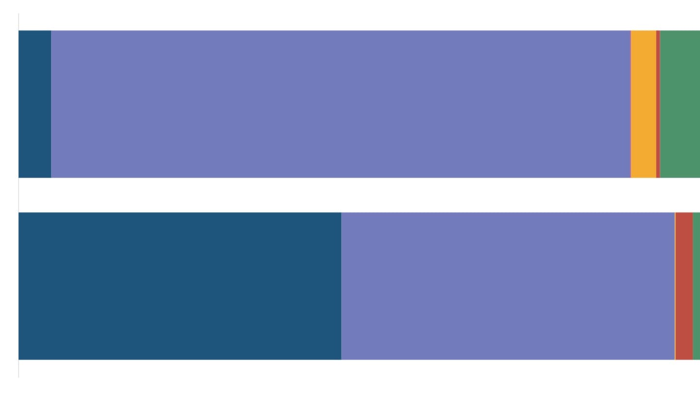
Crude indicators like the death rate are useful but are also, as the name suggests, crude. If you think about the death rate, it is composed of both elderly people dying as is the natural order of life, as well as the preventable premature deaths of under-nourished and children with poor access to clean environments and good healthcare. Unsurprisingly, it's when you decompose that death rate, as I did in my work on mortality in India, that you begin to understand what that one seemingly big shift may still be hiding.

The yellow dot there is the death rate across all age groups in a state, and as we saw above, it's quite similar across the country now. But look again at the blue dot (death rate among infants) and the red dot (death rate among people in their late 60s) in the two developed southern states at the top of this graph and the two poorer states at the bottom. The contrast is striking. "Comparing age-specific mortality rates across Indian states shows the disproportionate risks to the very young in India's poorest states, where the risk of dying in infancy remains higher than the risk of dying at older ages," I write in the piece.
Over time, this graph will change too, as the poorer states raise their standards of living, and the blue and red dots start to trade places, with risks of dying in old age becoming higher than in infancy. That will be the next, life-altering big shift for those states.