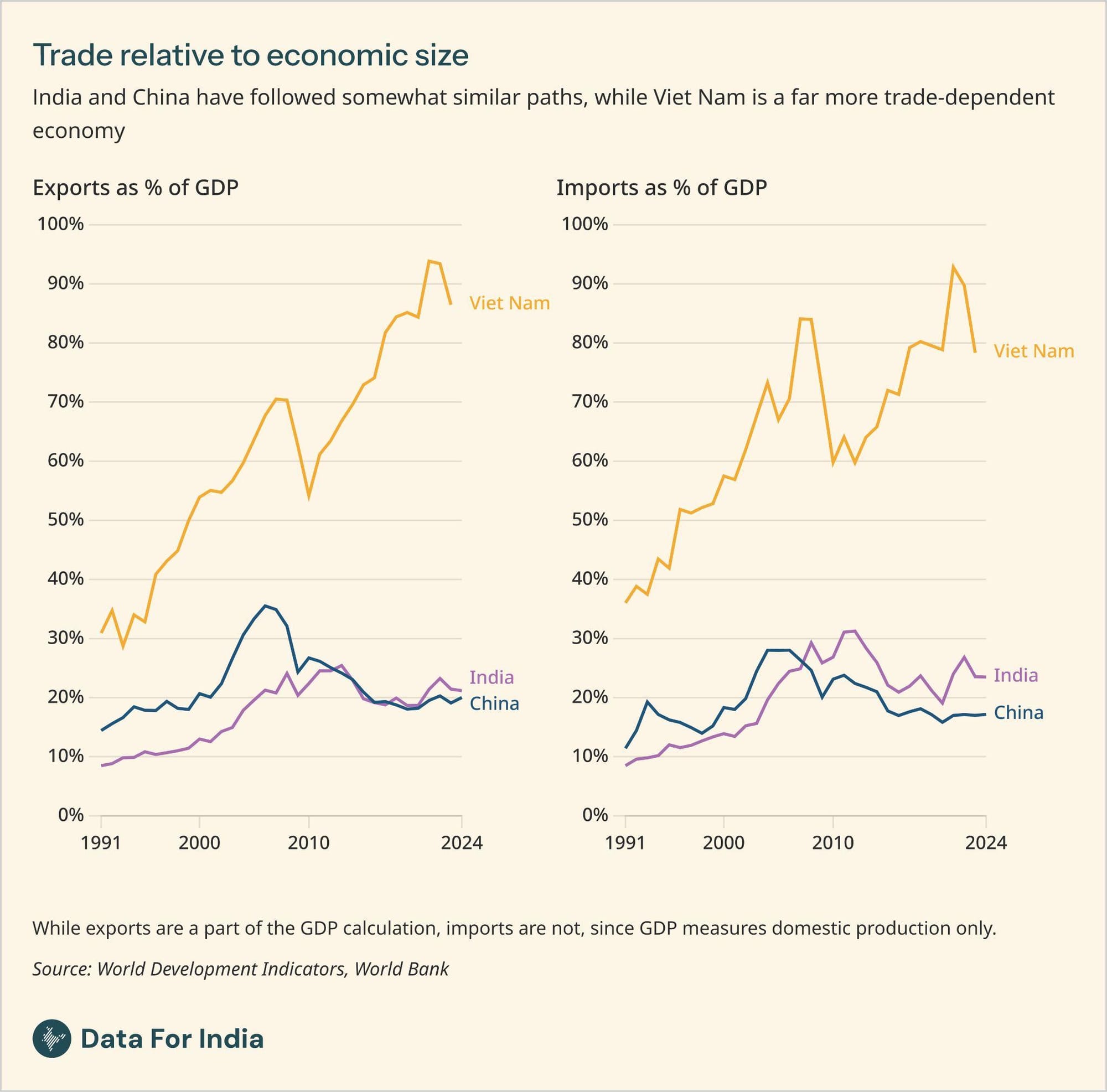
We've been doing some thinking lately about whether people understand data better through text or through visuals, and of course there's no one answer. It may depend upon the reader and their circumstances, on the specific point being made and so many other things. But here's one example of a visual that made a statistical concept clearer to me than text could have.
Technically I understand what inflation means. Technically I understand how inflation affects GDP growth. But still, it took this chart in my colleague Abhishek Waghmare's explainer for us on the GDP to really understand how to factor inflation into my understanding of India's GDP growth.
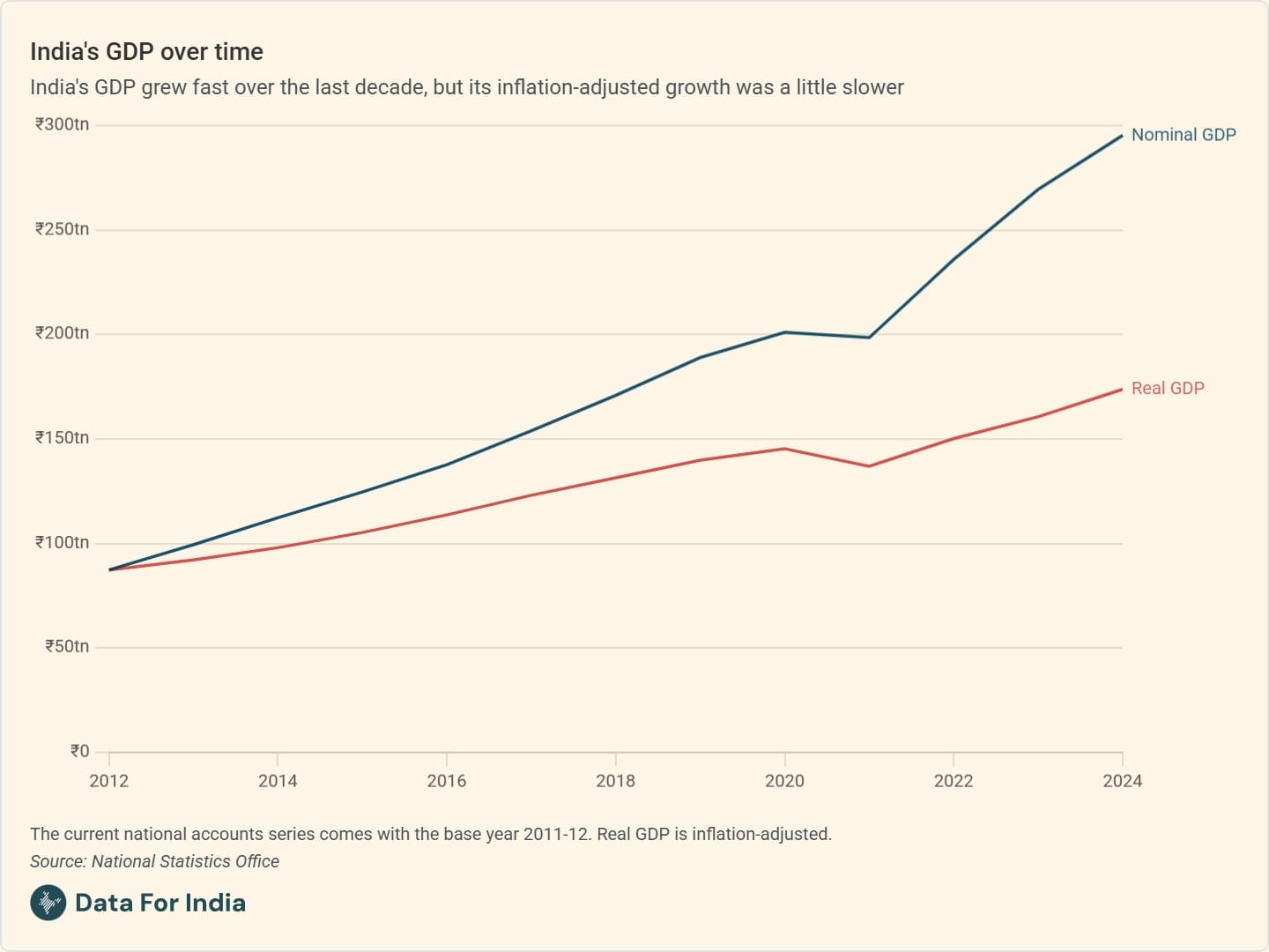
"When the GDP is calculated at current or prevailing prices in the local currency, that is called the nominal GDP," Abhishek writes in the piece. "However this might mask the effect of rising prices - the GDP may have grown but if at the same time the prices of food and other inputs went up at the same rate, then that doesn't translate to material improvements in life in the country. As a result, economists adjust the effect of inflation or price growth, to get what is called the real GDP. For this, they look at GDP growth assuming that prices have remained the same as at a particular point in time. In the last decade, while India's nominal GDP (at current prices) has grown at an average rate of 10.9%, real GDP (at constant 2011-12 prices) has grown at 5.6% per year."
None of this is about whether India's GDP is growing or not; the big shift in the economy, as Abhishek writes in the piece, is of a take off. "After decades of growing far slower than East Asian countries and than the world average, GDP growth in India took off from the 1980s. Since the 2010s, India has become one of the world's fastest growing economies, with its post-pandemic growth rates in particular being higher than those of many emerging economies including China," he writes. But it's a simple visual explanation of inflation and of real and nominal GDP that will remain in my understanding in the way that the text above may not.
Words and visuals are only as good as the people deploying them, and we continue to think and innovate about the best ways to communicate data. This one time, though, I think the visual does a better job at getting at the real big shift.