At Data For India, our mission is to explain India through the data. This often means looking at the newest possible data along multiple dimensions to understand the current state of socio-economic conditions. What this can sometimes obscure, however, is the long sweep of (recent, modern) history. Once every week, The Big Shift newsletter will take this long view of change in India.
The reason we don't see that much of the long view is not just that memories are short and that media incentives are better aligned to discussing the most recent data. It's also that historical data can be hard to put together. Older data can be difficult to find, is at times in unfriendly formats and building comparability over time when questions and indicators change is challenging. At Data For India, a lot of our research and data work goes into creating such time series, all from public data.
Data For India is not trying to tell "good news stories" or "bad news stories", but is simply trying to provide insight based on what a non-partisan view of credible Indian data can tell us. Similarly, not every big shift that this newsletter looks at will be a single line trending from bottom left to top right, every time. On some key health indicators, progress has not been on anticipated lines. On some aspects of employment, trajectories have been surprising and at odds with economic expectations. On some indicators of living conditions, access has improved, but the type of amenity most people have access to is not the most sustainable. Yet on many, many indicators, the long view is not just awe-inspiring, it's also moving.
Consider this chart from my colleague Nileena Suresh's first piece for us, which looks at access to electricity over time.
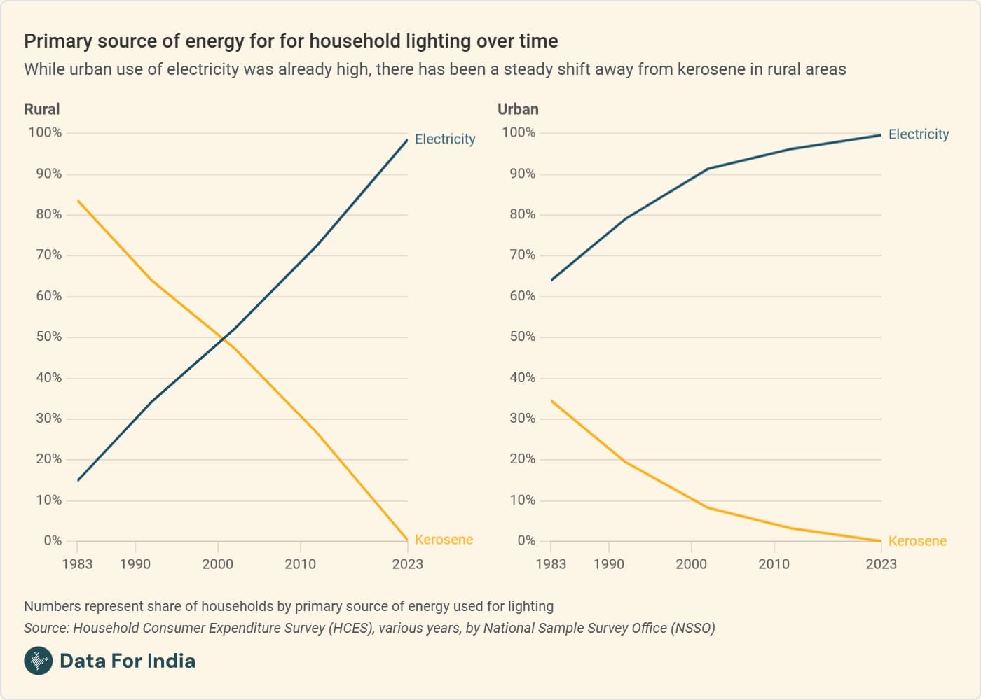
I'll take a quick moment to explain what precisely the indicator is that we're looking at, because it matters. One very real and legitimate concern when looking at data on access to amenities like sanitation and water is that the data might show the number of electricity connections or water tap connections, but if they don't work or are too expensive, people might not be able to use them, and then it ends up being a misleading indicator. This is absolutely true - schemes progressing is important, but taps are not people, and we want to know how people's lives are changing. So the indicator Nileena uses here is the share of survey respondents by their answer to the question: "What is the primary source of fuel that your household uses for lighting?" Which means that a person who has got an electric line coming to her house but doesn't use it much because the voltage is low, and mainly uses kerosene, would answer: keosene. That makes it an indicator that measures usage in a real way, and not access on paper alone.
I'll also take a moment to talk about the data sources that Nileena has used, because that's important too - it's hard to feel the whole weight of this graph if you don't trust the data, and for that, it's important to know where it came from. The National Sample Survey Office is India's premier statistical agency, with a 70 year history of conducting household surveys that conform to international standards, are widely respected globally, and have substantial oversight within the country as well. The Household Consumption Expenditure Survey by the NSSO that Nileena uses for this piece has been conducted more than ten times over the decades, surveys over 250,000 households in a sample that is nationally representative, and was most recently conducted in 2022-23. The raw data is publicly available, and at Data For India, we work directly from this raw data.
Now on to the big shift. Forty years ago, when Kapil Dev's Indian team won the men's cricket World Cup, more than eight in ten rural households used kerosene to light their homes. That share is now down to virtually zero. Electricity is what lights most Indian homes now - it's what people themselves say. This is a transformative change not just for the country's economy, but also because we have some evidence from a systematic review of the positive effects of electricity on household socioeconomic outcomes including on education and health. And it's happened within half a lifetime
This does not mean that Indian households face no electricity deficits any more. Nileena's piece looks at who the people who do not yet use electricity as their primary source of electricity are, and she finds that about one in five of the poorest rural households still do not have access to electricity. She also looks at how much electricity is consumed on average, and I was surprised by how low that number was for most Indians.
Our work at Data For India will always look at all of that nuance. But that was this week's big shift - the electrification of India.