In our use of charts at Data For India, we are very conscious of two sometimes conflicting aims - the chart should be simple, and the chart should look good. One of the styles of charting that creates the most conflict around this principle is the stacked chart. I'll explain through this week's big shift, which is on the increase in the availability of healthcare professionals relative to the population in India.
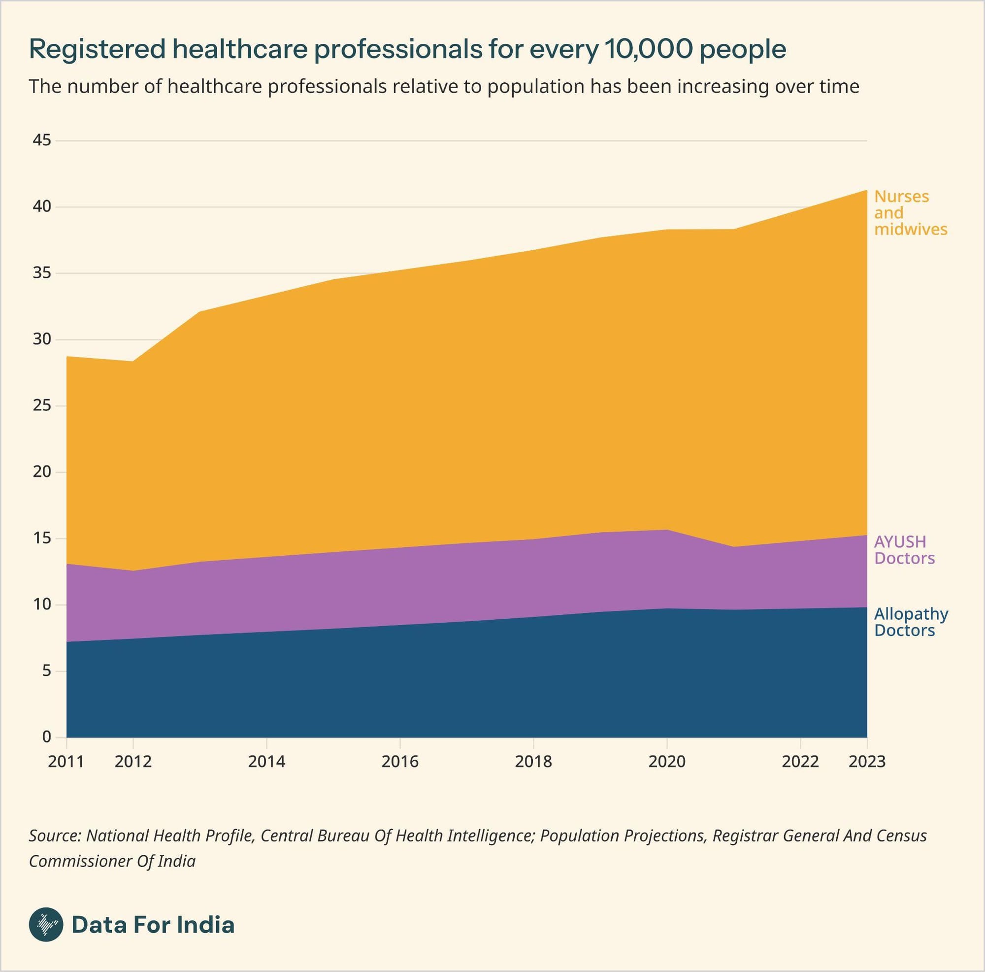
My colleague Nileena Suresh did a lot of reading of documentation to understand a simple, often cited indicator - the number of skilled healthcare professionals relative to the population. Using World Health Organization norms, she finds that in India, the definition of skilled healthcare professionals applies to registered doctors, registered nurses and midwives, and registered AYUSH (Ayurveda, Yoga and Naturopathy, Unani, Siddha, and Homoeopathy) practitioners. Adding them up, India has about 41 registered healthcare professionals for every 10,000 people, which is close to the WHO's suggested threshold of 44.5 per 10,000 people needed to meet healthcare-related sustainable development goals.
That produces this stacked chart showing the improvement in the relative availability of skilled healthcare professionals over time.
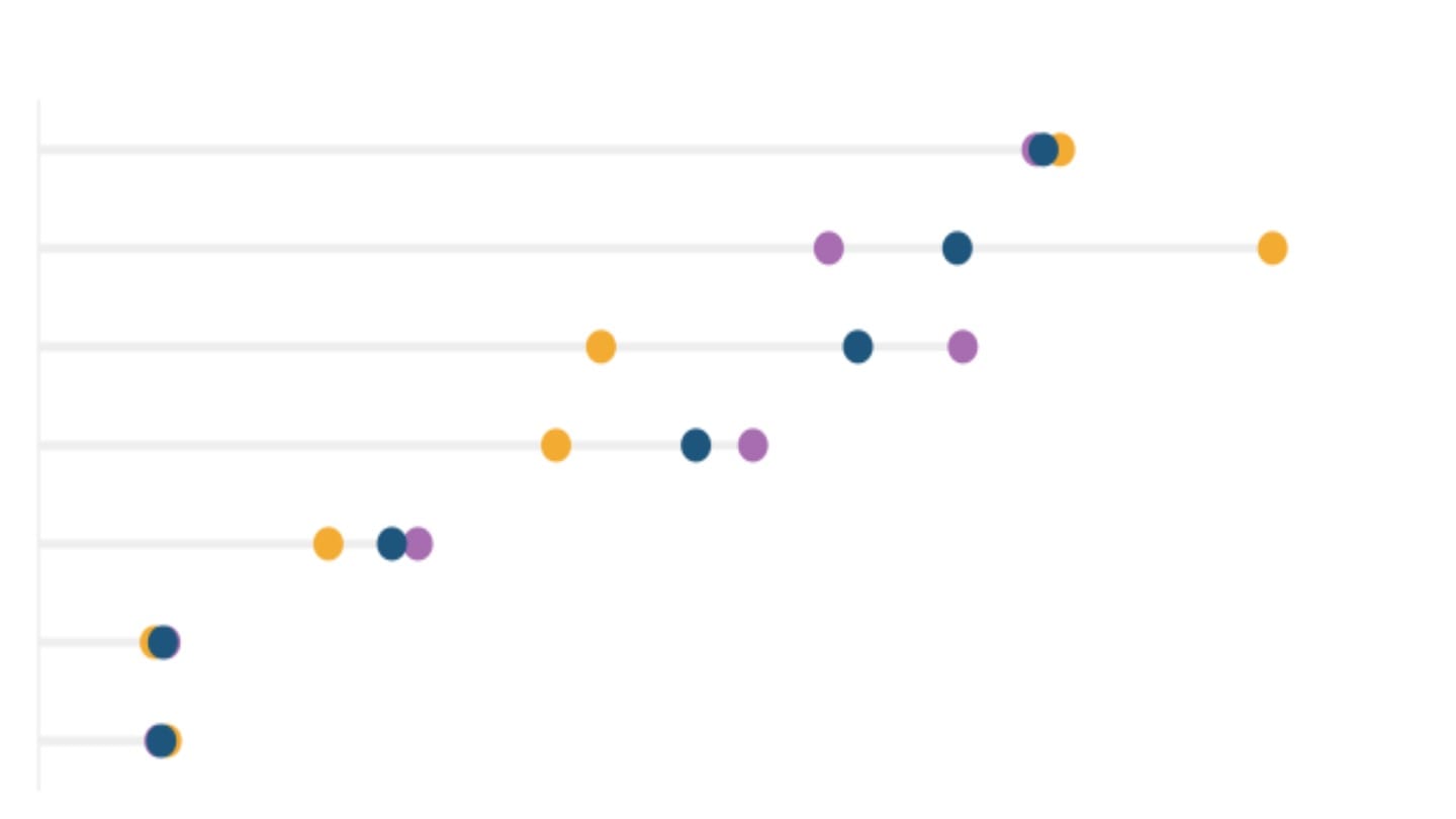
But here's a look at the same chart as lines instead of stacking them one over the other.
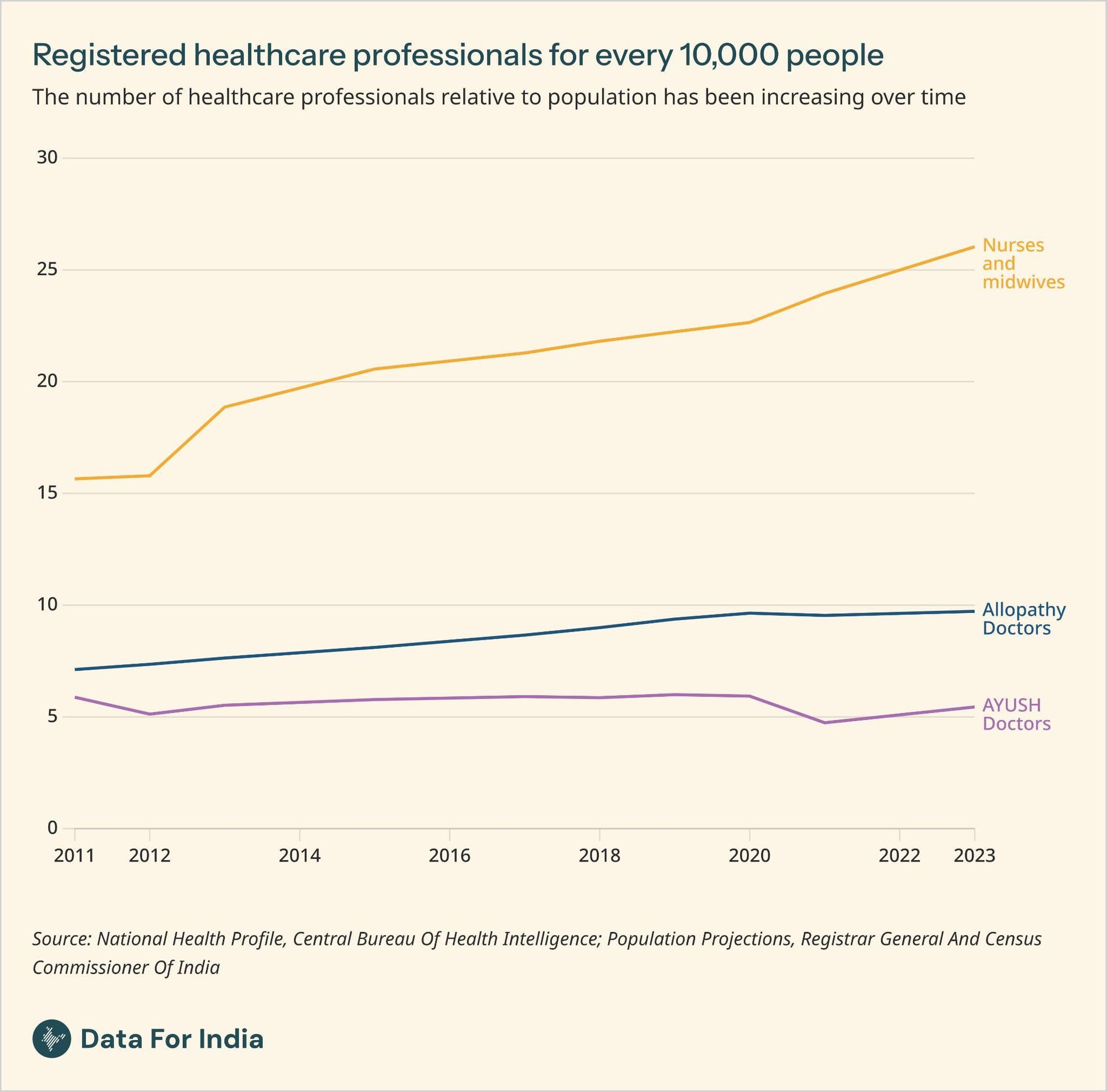
You see immediately that the increase is driven by the increase in nurses and midwives, and not so much by doctors.
That first stacked chart was not incorrect, gave a comprehensive picture, and in my personal, subjective, opinion, also looked better. But it could perhaps prevent a reader from seeing what's going on in the individual sub-components. There's still a shift here, but one with a bit more nuance, and we're still trying to make up our minds about the best ways to show these things.